General City Books (Not Specific to New York) |
New York City has to be one of the greatest places in America, if not the world.
Luckily for us, many authors have chronicled The Big Apple's antics in a way just right
for kids.
Here are some of
the books available. This is not yet a complete list, but I'm adding
books to the list daily. If you wish to purchase any of these books, click on either the title or the book cover to be directed to Amazon.com. As a warning, I have put up pictures of the book covers to give you somewhat an idea of the style of each book (I know, I know. "Don't judge a book by its cover") so the pages may load slowly, depending on the speed of your internet connection.
The categories below are sorted by approximate age group and topical categories. Feel free to browse around. The same links are located on the left side of your screen. To return back to this page, simply click on the "Welcome" link on the left.
If this website came up without frames, click here to see the complete "New York City Books for Kids" website with frames.
Other Pages of Interest:
Fiction & Historical Fiction:
General Books About New York City (Nonfiction) |
Fiction NYC Picture Books and "Easy Reader" Stories (Ages 4-8) |
Fiction NYC Books (Ages 9-12) |
New York Fiction for Young Adults |
New York Historical Fiction (Colonial Period and Revolutionary War) |
New York Historical Fiction (Ellis Island & Immigration) |
New York Historical Fiction (Life in the 1800s) |
New York Historical Fiction (Life in the 1900s)
NYC History:
New York Biographies |
Native Americans from New York (History and Historical Fiction) |
New York History (Colonial Period and Revolutionary War) |
New York History (Immigration and Ellis Island) |
New York History (The 1800s) |
New York History (The 1900s) |
The World Trade Center and September 11, 2001 |
NYC Locations:
The Statue of Liberty |
The Empire State Building |
Central Park |
NYC Art Museums (Metropolitan Museum of Art, The Museum of Modern Art, etc.) |
NYC's American Museum of Natural History |
Harlem Books (Including books about the Harlem Renaissance) |
Chinatown Books |
Little Italy Books |
The New York City Subway System |
Brooklyn Books |
The Bronx Books |
Queens Books |
Staten Island Books |
Long Island Books |
Upstate New York Books |
New York State Books
Life and Travel in NYC:
Thanksgiving in New York City |
Christmas in New York City |
New York Sports Teams and Players
The NYC Fire Department (FDNY) and NY Police Department (NYPD) |
General Books About Cities |
New York City and New York State Test Preparation and Study Guides |
New York Regents Review Books |
Parenting in New York City |
New York Travel Guides for Families with Children
NYC Toys, Puzzles, and Games (For Kids & Adults) |
Amazon.com Coupon Codes
Fiction for Beginning Readers
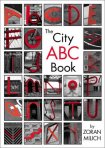
The City ABC Book
By Zoran Milich
Every large city is filled with sights and sounds and lots and lots of words. But have you ever looked at the city itself? At the shapes created by wood, concrete, metal and paint? A keen eye and a little inspiration are all it takes to discover a hidden alphabet among the architecture of a bustling metropolis.
The City ABC Book features dramatic black-and-white photographs of urban landscapes with hidden letters boldly highlighted in red. Children will be inspired to take a second look at the world around them as their powers of observation are enhanced, and their imaginations are allowed to soar.
Description from Publisher
How many alphabet books do we need? At least one more: this one, which resonates with the wit and creativity of Canadian photojournalist Milich. Inspired by daily walks with his daughter Hannah, Milich searched Toronto for hidden geometrics--letters buried in everyday places. From window frames in the shape of As to steel-welded Zs that support a bridge, he finds and documents them--in black and white, highlighting each letter in stop-sign red. Most children will pick a favorite letter, but each picture is a wonder and every letter a clear, playful image to consider and behold.
Description from Booklist
Everyone knows that when three- and four-year-olds play hide-and-seek, they tend to hide in plain sight and don't keep quiet for long—and those playing with them better not be too hard to find, either. Zoran Milich has produced a photographic find-the-letter alphabet book ideal for this younger age group, which loves to find letter shapes in everyday objects. The hidden letters are revealed instantly because they have been tinted a satisfying fire-engine red. And if that's not enough of a hint, the letter (in both capital and lower case) is printed below the picture or on the facing page in the same red, in a simple sans serif typeface. As in Stephen T. Johnson's Alphabet City, each letter is found in an urban location: manhole cover, bike rack, fire escape. The only image that won't be recognizable to all is Q, showing an upside-down white bicycle graphic painted on asphalt to denote a bike lane. Beautifully composed and reproduced in high contrast, the subjects range from gritty to gently humorous. A variety of image sizes also helps vary the pacing of the book, with some letters receiving a two-page spread while others are set two-to-a-page with generous white space. A brilliantly simple idea executed in a classic manner.
Description from Horn Book
For the observant and the imaginative, the letters of the alphabet can be found in everyday objects. The author takes the reader on a visual tour of his neighborhood where the letter E can be seen in a brick frame around a window, the letter V is hidden on a drain grate and the letter G is cleverly disguised within a clothesline pulley. Crisp black-and-white photos reveal the secret world of letters with an eye-catching red outlining the hidden letter. Similar in concept to Stephen Johnson's Alphabet City, this visual search for upper and lower case letters will have wide appeal among those who like an optical challenge.
Description from Children's Literature
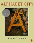
Alphabet City
By Stephen T. Johnson
Awards:
- A 1996 Caldecott Honor book
This is hardly an alphabet book for preschoolers; some of the depictions of letters may stump older kids (or even adults!). Nevertheless, the artwork is quite amazing. At first glance, or even second, the art appears to be photographs, such is the beautiful clarity of the pictures. However, the paintings are actually done in pastels, watercolors, gouache, and charcoal on hot pressed watercolor paper. The images themselves, one to a page, with each forming a letter of the alphabet, are urban: A is a construction sawhorse; P, a handrail in the subway; Z, a building's fire escape. Some of the pictures, especially those that use negative space, are harder to spot. Still, this is sure to intrigue, and art teachers, especially, will enjoy finding ways to use such a unique offering.
Description from Booklist
Beginning with the A formed by a construction site's sawhorse and ending with the Z found in the angle of a fire escape, Johnson draws viewers' eyes to tiny details within everyday objects to find letters. In this wordless tour of sights from Times Square to the Brooklyn Bridge, he invites young and old alike to take a new look at familiar surroundings, discovering the alphabet without ever looking in a book or reading from a sign. Conceived in the tradition of Ann Jonas's work, especially The Thirteenth Clue, Johnson's pastel, watercolor, gouache, and charcoal paintings are much more realistic than his illustrations for The Samurai's Daughter; in fact, they are almost photographic in appearance. Some of the images are both clever and incredibly clear, e.g., the E found in the sideways view of a traffic light. Others, such as the C in the rose window of a Gothic church, are more obscure. Nevertheless, all of the paintings are beautifully executed and exhibit a true sense of artistic vision. While parents or teachers might assume from the title that this is a traditional alphabet book, they should be encouraged to look at it as an art book. It's sure to inspire older children to venture out on their own walks to discover the alphabet in the familiar objects of their own hometowns.
Description from School Library Journal
The scenes of New York City look like photographs, but they are actually realistic paintings that reveal the alphabet in a most unusual way. For example the letter "G" shows up in the grill work of lamppost and an "H" appears within a scene of two buildings connected by an walkway. It is intriguing and requires a bit of sophistication on the part of the reader.
Description from Children's Literature
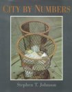
City by Numbers
By Stephen T. Johnson
In this wordless companion to Alphabet City, Johnson joins the likes of Tana Hoban, Arlene Alda, and Donald Crews in his attraction to the numbers, letters, shapes, and compositions found in the architecture and infrastructures of outdoor places and public spaces. Paintings show numerals 121 that are camouflaged by the urban cityscapes in which they exist. Discovering each number is an exercise in visual literacy: 4 is found in the lines of the Manhattan Bridge at sunset, 8 is formed by the round rims of adjoining trash bins, a 15 hides in the cracked mortar between bricks. Some numbers occur in the lines, curves, and curlicues of existing architecture, such as an iron gate, a fire escape, a cornice; others are created by negative space, for example, between stones on a snowy walkway or in the scraped surface and papery patches of a building's peeling paint. The subjects are similar to those found in the first book, although the colors, this time, are wintry and more somber. Children will relish the game of locating numbers, while adults will pause over Johnson's deliberate use of shape and color to influence mood.
Description from Kirkus Reviews
In his newest creation Johnson does for numbers what he did for letters in Alphabet City. In and around New York City, Johnson explores angles, circles, squares, and intersecting lines from unusual perspectives. The number five emerges form the shadow of branches on a brick wall, trash baskets clearly reveal the number eight, and two tall smoke stacks are easily recognizable as the number eleven. In each of the stunning illustrations, visual acuity is the key. Some of the numbers are not readily discernible but the imaginative observer who looks for the unusual will be rewarded. Insightful, playful, poetic, this picture book will delight older children and art students of all ages.
Description from Children's Literature
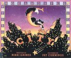
C Is for City
By Nikki Grimes
City is the operative word in this hustling, bustling, urban ABC book. It begins, "A is for arcade or ads for Apartments / on short streets with alleys alive with stray pets. / A is for Afghans named after their owners / who drive them to art shows in silver Corvettes." Cummings' lively cartoonish illustrations depict all of these a words, plus countless more tucked in for the keen-eyed reader. (A key in the back of the book lists all illustrated objects.) The rhymes themselves are quite clever and packed with vocabulary-expanding images. Each illustration is a hearty slice of urban life, with all its intersecting dramas and scenes within scenes. At a diner, for instance, four different dramas play out, including a doorman jumping double-Dutch and a teen flirting with the waitress. Certainly city children will identify with the book, but any child should find in its busy illustrations much worth discussing or poring over alone.
Description from Booklist
Gorgeous, vivid color illustrations are liberal embellishments to this alphabet rhyme of big city life. Urban-oriented kids will especially appreciate these familiar associations; from "K is for kosher shops/selling knishes" to "P is for playground or Pop's Pizzeria".
Description from Midwest Book Review
In this rhyming alphabet book, each letter represents different New York City experiencese.g., "A is for arcade or ads for apartments.../B is for butcher or/breakfast with bagels/or block-party bands/out on hot summer nights. C is for city/or cabbies named Clarence/or cool cats who chat/under boulevard lights." Many of the arresting images reflect the ethnic, religious, and economic diversity of urban life. From a sleek sports car with a bejeweled Afghan to tawdry fortune tellers and other entertainers, a wide range of people and neighborhoods are depicted. The rhythm of the verses is also varied, but it is always interesting and right on target for the audience. Illustrations in vivid, neon colors suggest the electricity and brashness of a loud city with its hard edges as well as the teeming population. In addition to the letter-specific items mentioned, others are incorporated into the pictures for sharp-eyed viewers to find. An entertaining selection along the lines of "A my name is Alice," set in the Big Apple.
Description from School Library Journal
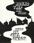
Round Trip
By Ann Jonas
This book isn't just the story of a round trip — it is a round trip! Read forward and look at the sights, then flip the book over to see something different on the way back. Ann Jonas's amazing two-way trip is guarnateed to change the way you look at things!
Description from Publisher
The story is a simple and elegant rendition of an outing to the city and the structure of the book makes it memorable to child and parent. The first section details the trip to the city, with the car passing fields and trains and bridges; at the end, turn the book over and the narrative picks up again-but those pictures have been transformed into pictures of factories and cars and freeways passed on the return trip.
Description from Children's Literature
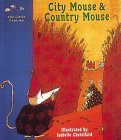
City Mouse & Country Mouse: A Classic Fairy Tale
By Isabelle Chantellard
Two mice cousins, one from the city and the other from the country, visit each other, and each concludes that his own life is better. Without preaching, this tale helps children understand that one person's preference or way of life, though different, is not necessarily better or worse than their own.
This story has been adapted for children today while respecting the richness and flavor of the original version. The size of the book and its warm, inviting illustrations will appeal to young children, who will be captivated by the game page at the end.
Description from Publisher
Chatellard has created a charming retelling of the traditional tale in which rodent cousins visit each other at home and find that they each prize their own, respective lifestyles. The message is clear: even mice can have different tastes and there truly is no place like home. To make sure that little readers are paying attention, a game at the end of the book asks them to put in order pictures taken from the story. Delightful drawings highlight this little lap book.
Description from Children's Literature

Bernelly & Harriet: The Country Mouse and the City Mouse
By Elizabeth Dahlie
Bernelly is a country mouse who spends most of her time outdoors, teaching fly-fishing and tying beautiful flies. Harriet is a famous artist who lives and paints in her cozy apartment in the heart of the city. When a leaky boot sends Bernelly to the city for a new pair, Harriet tries to persuade her that city life is best. Bernelly has fun visiting museums, attending the ballet, and shopping in fancy stores, but insists that Harriet sample country life. Each mouse tries hard to enjoy the other's life, but each finally finds the most happiness right at home.
Description from Publisher
In this perky twist on a favorite tale, two mouse cousins appreciate that there's no place like home after spending time on each other's turf. Country mouse Bernelly likes nothing better than teaching fly-fishing in the nearby river in the good weather and tying beautiful flies in her cottage through the winter. City mouse Harriet paints in her apartment/studio in between dining out, exploring parks and museums, and enjoying the ballet. The two mice eventually cross paths when Bernelly's need for a new pair of boots prompts a shopping trip to the city (and a visit to Harriet). After a busy week of sightseeing, Bernelly longs for home. ("It is just too crowded and noisy here," she says of the city). Harriet, curious to experience the joys of country living, accompanies Bernelly on the trip back. But finding the riverbank too quiet, Harriet is soon eager to return to "the noise, the smells, the shopping!" of Boston. Dahlie's (Henrietta) text clicks along, peppered with plenty of humorous, contemporary details. The expressions on each of the heroine's faces convey the evidence of these fish out of water, whether Bernelly's discomfort as she tries on a pair of red high-heel shoes while searching for her boots or Harriet's ennui as she listens to "tales of trout" at her cousin's dinner party. Her gouache paintings a cross between Petra Mathers and Kevin Henkes capture the best of both mouse worlds and convey the gentle joviality and affection of the story.
Description from Publishers Weekly
This modern take on the classic story features delicate pastel-toned gouache illustrations. Bernelly lives in the country and works as a fly-fishing instructor. When she needs a new pair of boots, she decides to go to the city to get them, and visit her cousin Harriet as well. After a week, poor Bernelly is overwhelmed, and she invites her cousin back to enjoy a relaxing stay in the country. Harriet, however, is not impressed with fly-fishing, gardening, or dinnertime full of long stories about trout, and is even happier with her city home when she returns. Dahlie's illustrations are breathtaking, often creating beautiful landscapes from the merest hints of shadow and color. It is slightly disturbing to see that, while Bernelly endures her stay in the city with a smile, Harriet spends the entire time in the country with a condescending expression on her face. This stereotype aside, the cousins' affection for one another shines through, and this beautifully illustrated rendering of the story will find a home in larger collections.
Description from School Library Journal
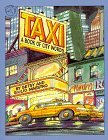
Taxi : A Book of City Words
By Betsy Maestro
It is morning in the city as the yellow taxi pulls up to the curb. It has many people to pick up today and many places to go. It visits a tall skyscraper, a busy pier, a fancy hotel. The bright yellow taxi will delight children as it travels the city teaching new words.
Description from Publisher
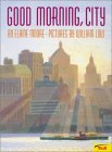
Good Morning, City
By Elaine Moore
As the sun rises, a city comes to life. People go to work, subways rumble, children set off for school, a tall ship enters the harbor, and shops open for business. Even though a city never sleeps, morning is a magical time of renewal, and william Low's subtle, emotion-filled illustrations capture the beautiful moments of a new day. Many of the illustrations are based on scenes from New York City, but this book celebrates what is magical about every great city.
Description from Publisher
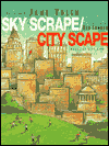
Sky Scrape/City Scape: Poems of City Life
By Jane Yolen (Editor)
This worthy successor to Lee Bennett Hopkins's The City Spreads Its Wings offers readers a glorious glimpse of New York City in particular and urban centers in general. Lively chalk-and-pastel scenesstreets, parks, crowdsappear on every page with poetry that celebrates one aspect of city life. Langston Hughes, Judith Thurman, Felice Holman, and Ann Turner are among the anthologized poets. Norma Farber's "Manhattan Lullaby" ("Lulled by rumble, babble, beep/let these little children sleep/let these city girls and boys/dream a music in their noise/hear a tune their city plucks/up from buses, up from trucks...") is a particularly memorable selection. A dynamic hymn to what Lucille Clifton refers to as "the inner city/ or/like we call it/ home."
Description from School Library Journal
Skyscrapers, subways, and crowded streets are the settings for the 25 poems and pictures in this anthology. The pages are packed with people, buildings, garbage, traffic. Everything is bursting with movement, light, and sound. Some poems have such power and energy: in Carl Sandburg's pounding "Prayers of Steel," in Ann Turner's jump-rope girl ("more like she stood still and the rope flew around her" ), in Lee Bennett Hopkins' flashing neon signs ("like fireworks fighting hard to explode" ). There are connections, too: in Betsy Hearne's "Commuters" swaying from straps; in Lilian Moore's "Pigeons" commuting from sidewalk to ledge; in Lucille Clifton's inner city ("or like we call it / home" ). From the first double-page spread of buildings that scrape the sky, to the trucks that roar out of the tunnels, the images have a physical immediacy and the words have a rhythm that will appeal to the elementary grades. Condon's rousing illustrations in chalk and oil pastel, filled with light and color, express the rumble and rush of city life. Like Adoff's Street Music: City Poems, this will be welcome in classrooms and libraries across the country, an exciting companion to all the volumes of nature poetry.
Description from Booklist
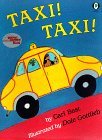
Taxi! Taxi!
By Cari Best
Tina can't wait for Sundays, the day her Papi, who "lives someplace else," comes to pick her up in his yellow taxi. Some Sundays Papi doesn't come, but this time he does, taking Tina for a drive in the country, a picnic lunch, and a farm visit. On the way back to Tina's happy, bright city neighborhood, Papi and Tina stop to offer enough free rides to neighbors to pack the taxi and cap the day for a proud Tina. Gottlieb's broad, exuberant pastels fill the pages. Their backgrounds, whether sky or landscape, are so intensely colored that Tina's day with her father takes place in a rich, filled-in world. The artwork's flat perspective reminds us of children's drawings and conveys an affection for the everyday. The text recognizes that Papi sometimes forgets to visit and concentrates on Tina's pleasure spending time with him when he does arrive.
Description from Booklist
Tina and her mother share an apartment in a bustling, close-knit urban neighborhood where there's always something interesting to watch. Tina especially loves Sundays, the day her father, a taxi driver, comes to visit. Today's outing features a picnic at a farm in the country followed by an "always room for one more" taxi ride back home, scooping up Tina's neighbors along the way. Best, a fine storyteller, effortlessly weaves Spanish words and phrases into her lively tale (Tina is Latino). This is not a "problem" book; although Tina's sadness with her parents' separation is evident, the story focuses on the relationship between her and her father, a relationship that is both sweet and genuine. Stylistically, Gottlieb's vibrant, intensely colored illustrations might be classified as post-modern primitive; artistically, they both enlarge and enrich the tale.
Description from Publishers Weekly
Fiction for Older Readers
Nonfiction
Back to "New York City Books for Kids"
Still can't find what you're looking for? Search Amazon.com's database directly.
©2002-2003
(NOTE: The advertisements below have not been placed on the site by its owners. We are not responsible for their content.)
If this website came up without frames, click here to see the complete "New York City Books for Kids" website with frames.
Other Pages of Interest:
Fiction & Historical Fiction:
General Books About New York City (Nonfiction) |
Fiction NYC Picture Books and "Easy Reader" Stories (Ages 4-8) |
Fiction NYC Books (Ages 9-12) |
New York Fiction for Young Adults |
New York Historical Fiction (Colonial Period and Revolutionary War) |
New York Historical Fiction (Ellis Island & Immigration) |
New York Historical Fiction (Life in the 1800s) |
New York Historical Fiction (Life in the 1900s)
NYC History:
New York Biographies |
Native Americans from New York (History and Historical Fiction) |
New York History (Colonial Period and Revolutionary War) |
New York History (Immigration and Ellis Island) |
New York History (The 1800s) |
New York History (The 1900s) |
The World Trade Center and September 11, 2001 |
NYC Locations:
The Statue of Liberty |
The Empire State Building |
Central Park |
NYC Art Museums (Metropolitan Museum of Art, The Museum of Modern Art, etc.) |
NYC's American Museum of Natural History |
Harlem Books (Including books about the Harlem Renaissance) |
Chinatown Books |
Little Italy Books |
The New York City Subway System |
Brooklyn Books |
The Bronx Books |
Queens Books |
Staten Island Books |
Long Island Books |
Upstate New York Books |
New York State Books
Life and Travel in NYC:
Thanksgiving in New York City |
Christmas in New York City |
New York Sports Teams and Players
The NYC Fire Department (FDNY) and NY Police Department (NYPD) |
General Books About Cities |
New York City and New York State Test Preparation and Study Guides |
New York Regents Review Books |
Parenting in New York City |
New York Travel Guides for Families with Children
NYC Toys, Puzzles, and Games (For Kids & Adults) |
Amazon.com Coupon Codes
Fiction for Beginning Readers

The City ABC Book
By Zoran Milich
Every large city is filled with sights and sounds and lots and lots of words. But have you ever looked at the city itself? At the shapes created by wood, concrete, metal and paint? A keen eye and a little inspiration are all it takes to discover a hidden alphabet among the architecture of a bustling metropolis.
The City ABC Book features dramatic black-and-white photographs of urban landscapes with hidden letters boldly highlighted in red. Children will be inspired to take a second look at the world around them as their powers of observation are enhanced, and their imaginations are allowed to soar.
Description from Publisher
How many alphabet books do we need? At least one more: this one, which resonates with the wit and creativity of Canadian photojournalist Milich. Inspired by daily walks with his daughter Hannah, Milich searched Toronto for hidden geometrics--letters buried in everyday places. From window frames in the shape of As to steel-welded Zs that support a bridge, he finds and documents them--in black and white, highlighting each letter in stop-sign red. Most children will pick a favorite letter, but each picture is a wonder and every letter a clear, playful image to consider and behold.
Description from Booklist
Everyone knows that when three- and four-year-olds play hide-and-seek, they tend to hide in plain sight and don't keep quiet for long—and those playing with them better not be too hard to find, either. Zoran Milich has produced a photographic find-the-letter alphabet book ideal for this younger age group, which loves to find letter shapes in everyday objects. The hidden letters are revealed instantly because they have been tinted a satisfying fire-engine red. And if that's not enough of a hint, the letter (in both capital and lower case) is printed below the picture or on the facing page in the same red, in a simple sans serif typeface. As in Stephen T. Johnson's Alphabet City, each letter is found in an urban location: manhole cover, bike rack, fire escape. The only image that won't be recognizable to all is Q, showing an upside-down white bicycle graphic painted on asphalt to denote a bike lane. Beautifully composed and reproduced in high contrast, the subjects range from gritty to gently humorous. A variety of image sizes also helps vary the pacing of the book, with some letters receiving a two-page spread while others are set two-to-a-page with generous white space. A brilliantly simple idea executed in a classic manner.
Description from Horn Book
For the observant and the imaginative, the letters of the alphabet can be found in everyday objects. The author takes the reader on a visual tour of his neighborhood where the letter E can be seen in a brick frame around a window, the letter V is hidden on a drain grate and the letter G is cleverly disguised within a clothesline pulley. Crisp black-and-white photos reveal the secret world of letters with an eye-catching red outlining the hidden letter. Similar in concept to Stephen Johnson's Alphabet City, this visual search for upper and lower case letters will have wide appeal among those who like an optical challenge.
Description from Children's Literature

Alphabet City
By Stephen T. Johnson
Awards:
- A 1996 Caldecott Honor book
This is hardly an alphabet book for preschoolers; some of the depictions of letters may stump older kids (or even adults!). Nevertheless, the artwork is quite amazing. At first glance, or even second, the art appears to be photographs, such is the beautiful clarity of the pictures. However, the paintings are actually done in pastels, watercolors, gouache, and charcoal on hot pressed watercolor paper. The images themselves, one to a page, with each forming a letter of the alphabet, are urban: A is a construction sawhorse; P, a handrail in the subway; Z, a building's fire escape. Some of the pictures, especially those that use negative space, are harder to spot. Still, this is sure to intrigue, and art teachers, especially, will enjoy finding ways to use such a unique offering.
Description from Booklist
Beginning with the A formed by a construction site's sawhorse and ending with the Z found in the angle of a fire escape, Johnson draws viewers' eyes to tiny details within everyday objects to find letters. In this wordless tour of sights from Times Square to the Brooklyn Bridge, he invites young and old alike to take a new look at familiar surroundings, discovering the alphabet without ever looking in a book or reading from a sign. Conceived in the tradition of Ann Jonas's work, especially The Thirteenth Clue, Johnson's pastel, watercolor, gouache, and charcoal paintings are much more realistic than his illustrations for The Samurai's Daughter; in fact, they are almost photographic in appearance. Some of the images are both clever and incredibly clear, e.g., the E found in the sideways view of a traffic light. Others, such as the C in the rose window of a Gothic church, are more obscure. Nevertheless, all of the paintings are beautifully executed and exhibit a true sense of artistic vision. While parents or teachers might assume from the title that this is a traditional alphabet book, they should be encouraged to look at it as an art book. It's sure to inspire older children to venture out on their own walks to discover the alphabet in the familiar objects of their own hometowns.
Description from School Library Journal
The scenes of New York City look like photographs, but they are actually realistic paintings that reveal the alphabet in a most unusual way. For example the letter "G" shows up in the grill work of lamppost and an "H" appears within a scene of two buildings connected by an walkway. It is intriguing and requires a bit of sophistication on the part of the reader.
Description from Children's Literature

City by Numbers
By Stephen T. Johnson
In this wordless companion to Alphabet City, Johnson joins the likes of Tana Hoban, Arlene Alda, and Donald Crews in his attraction to the numbers, letters, shapes, and compositions found in the architecture and infrastructures of outdoor places and public spaces. Paintings show numerals 121 that are camouflaged by the urban cityscapes in which they exist. Discovering each number is an exercise in visual literacy: 4 is found in the lines of the Manhattan Bridge at sunset, 8 is formed by the round rims of adjoining trash bins, a 15 hides in the cracked mortar between bricks. Some numbers occur in the lines, curves, and curlicues of existing architecture, such as an iron gate, a fire escape, a cornice; others are created by negative space, for example, between stones on a snowy walkway or in the scraped surface and papery patches of a building's peeling paint. The subjects are similar to those found in the first book, although the colors, this time, are wintry and more somber. Children will relish the game of locating numbers, while adults will pause over Johnson's deliberate use of shape and color to influence mood.
Description from Kirkus Reviews
In his newest creation Johnson does for numbers what he did for letters in Alphabet City. In and around New York City, Johnson explores angles, circles, squares, and intersecting lines from unusual perspectives. The number five emerges form the shadow of branches on a brick wall, trash baskets clearly reveal the number eight, and two tall smoke stacks are easily recognizable as the number eleven. In each of the stunning illustrations, visual acuity is the key. Some of the numbers are not readily discernible but the imaginative observer who looks for the unusual will be rewarded. Insightful, playful, poetic, this picture book will delight older children and art students of all ages.
Description from Children's Literature

C Is for City
By Nikki Grimes
City is the operative word in this hustling, bustling, urban ABC book. It begins, "A is for arcade or ads for Apartments / on short streets with alleys alive with stray pets. / A is for Afghans named after their owners / who drive them to art shows in silver Corvettes." Cummings' lively cartoonish illustrations depict all of these a words, plus countless more tucked in for the keen-eyed reader. (A key in the back of the book lists all illustrated objects.) The rhymes themselves are quite clever and packed with vocabulary-expanding images. Each illustration is a hearty slice of urban life, with all its intersecting dramas and scenes within scenes. At a diner, for instance, four different dramas play out, including a doorman jumping double-Dutch and a teen flirting with the waitress. Certainly city children will identify with the book, but any child should find in its busy illustrations much worth discussing or poring over alone.
Description from Booklist
Gorgeous, vivid color illustrations are liberal embellishments to this alphabet rhyme of big city life. Urban-oriented kids will especially appreciate these familiar associations; from "K is for kosher shops/selling knishes" to "P is for playground or Pop's Pizzeria".
Description from Midwest Book Review
In this rhyming alphabet book, each letter represents different New York City experiencese.g., "A is for arcade or ads for apartments.../B is for butcher or/breakfast with bagels/or block-party bands/out on hot summer nights. C is for city/or cabbies named Clarence/or cool cats who chat/under boulevard lights." Many of the arresting images reflect the ethnic, religious, and economic diversity of urban life. From a sleek sports car with a bejeweled Afghan to tawdry fortune tellers and other entertainers, a wide range of people and neighborhoods are depicted. The rhythm of the verses is also varied, but it is always interesting and right on target for the audience. Illustrations in vivid, neon colors suggest the electricity and brashness of a loud city with its hard edges as well as the teeming population. In addition to the letter-specific items mentioned, others are incorporated into the pictures for sharp-eyed viewers to find. An entertaining selection along the lines of "A my name is Alice," set in the Big Apple.
Description from School Library Journal

Round Trip
By Ann Jonas
This book isn't just the story of a round trip — it is a round trip! Read forward and look at the sights, then flip the book over to see something different on the way back. Ann Jonas's amazing two-way trip is guarnateed to change the way you look at things!
Description from Publisher
The story is a simple and elegant rendition of an outing to the city and the structure of the book makes it memorable to child and parent. The first section details the trip to the city, with the car passing fields and trains and bridges; at the end, turn the book over and the narrative picks up again-but those pictures have been transformed into pictures of factories and cars and freeways passed on the return trip.
Description from Children's Literature

City Mouse & Country Mouse: A Classic Fairy Tale
By Isabelle Chantellard
Two mice cousins, one from the city and the other from the country, visit each other, and each concludes that his own life is better. Without preaching, this tale helps children understand that one person's preference or way of life, though different, is not necessarily better or worse than their own.
This story has been adapted for children today while respecting the richness and flavor of the original version. The size of the book and its warm, inviting illustrations will appeal to young children, who will be captivated by the game page at the end.
Description from Publisher
Chatellard has created a charming retelling of the traditional tale in which rodent cousins visit each other at home and find that they each prize their own, respective lifestyles. The message is clear: even mice can have different tastes and there truly is no place like home. To make sure that little readers are paying attention, a game at the end of the book asks them to put in order pictures taken from the story. Delightful drawings highlight this little lap book.
Description from Children's Literature

Bernelly & Harriet: The Country Mouse and the City Mouse
By Elizabeth Dahlie
Bernelly is a country mouse who spends most of her time outdoors, teaching fly-fishing and tying beautiful flies. Harriet is a famous artist who lives and paints in her cozy apartment in the heart of the city. When a leaky boot sends Bernelly to the city for a new pair, Harriet tries to persuade her that city life is best. Bernelly has fun visiting museums, attending the ballet, and shopping in fancy stores, but insists that Harriet sample country life. Each mouse tries hard to enjoy the other's life, but each finally finds the most happiness right at home.
Description from Publisher
In this perky twist on a favorite tale, two mouse cousins appreciate that there's no place like home after spending time on each other's turf. Country mouse Bernelly likes nothing better than teaching fly-fishing in the nearby river in the good weather and tying beautiful flies in her cottage through the winter. City mouse Harriet paints in her apartment/studio in between dining out, exploring parks and museums, and enjoying the ballet. The two mice eventually cross paths when Bernelly's need for a new pair of boots prompts a shopping trip to the city (and a visit to Harriet). After a busy week of sightseeing, Bernelly longs for home. ("It is just too crowded and noisy here," she says of the city). Harriet, curious to experience the joys of country living, accompanies Bernelly on the trip back. But finding the riverbank too quiet, Harriet is soon eager to return to "the noise, the smells, the shopping!" of Boston. Dahlie's (Henrietta) text clicks along, peppered with plenty of humorous, contemporary details. The expressions on each of the heroine's faces convey the evidence of these fish out of water, whether Bernelly's discomfort as she tries on a pair of red high-heel shoes while searching for her boots or Harriet's ennui as she listens to "tales of trout" at her cousin's dinner party. Her gouache paintings a cross between Petra Mathers and Kevin Henkes capture the best of both mouse worlds and convey the gentle joviality and affection of the story.
Description from Publishers Weekly
This modern take on the classic story features delicate pastel-toned gouache illustrations. Bernelly lives in the country and works as a fly-fishing instructor. When she needs a new pair of boots, she decides to go to the city to get them, and visit her cousin Harriet as well. After a week, poor Bernelly is overwhelmed, and she invites her cousin back to enjoy a relaxing stay in the country. Harriet, however, is not impressed with fly-fishing, gardening, or dinnertime full of long stories about trout, and is even happier with her city home when she returns. Dahlie's illustrations are breathtaking, often creating beautiful landscapes from the merest hints of shadow and color. It is slightly disturbing to see that, while Bernelly endures her stay in the city with a smile, Harriet spends the entire time in the country with a condescending expression on her face. This stereotype aside, the cousins' affection for one another shines through, and this beautifully illustrated rendering of the story will find a home in larger collections.
Description from School Library Journal

Taxi : A Book of City Words
By Betsy Maestro
It is morning in the city as the yellow taxi pulls up to the curb. It has many people to pick up today and many places to go. It visits a tall skyscraper, a busy pier, a fancy hotel. The bright yellow taxi will delight children as it travels the city teaching new words.
Description from Publisher

Good Morning, City
By Elaine Moore
As the sun rises, a city comes to life. People go to work, subways rumble, children set off for school, a tall ship enters the harbor, and shops open for business. Even though a city never sleeps, morning is a magical time of renewal, and william Low's subtle, emotion-filled illustrations capture the beautiful moments of a new day. Many of the illustrations are based on scenes from New York City, but this book celebrates what is magical about every great city.
Description from Publisher

Sky Scrape/City Scape: Poems of City Life
By Jane Yolen (Editor)
This worthy successor to Lee Bennett Hopkins's The City Spreads Its Wings offers readers a glorious glimpse of New York City in particular and urban centers in general. Lively chalk-and-pastel scenesstreets, parks, crowdsappear on every page with poetry that celebrates one aspect of city life. Langston Hughes, Judith Thurman, Felice Holman, and Ann Turner are among the anthologized poets. Norma Farber's "Manhattan Lullaby" ("Lulled by rumble, babble, beep/let these little children sleep/let these city girls and boys/dream a music in their noise/hear a tune their city plucks/up from buses, up from trucks...") is a particularly memorable selection. A dynamic hymn to what Lucille Clifton refers to as "the inner city/ or/like we call it/ home."
Description from School Library Journal
Skyscrapers, subways, and crowded streets are the settings for the 25 poems and pictures in this anthology. The pages are packed with people, buildings, garbage, traffic. Everything is bursting with movement, light, and sound. Some poems have such power and energy: in Carl Sandburg's pounding "Prayers of Steel," in Ann Turner's jump-rope girl ("more like she stood still and the rope flew around her" ), in Lee Bennett Hopkins' flashing neon signs ("like fireworks fighting hard to explode" ). There are connections, too: in Betsy Hearne's "Commuters" swaying from straps; in Lilian Moore's "Pigeons" commuting from sidewalk to ledge; in Lucille Clifton's inner city ("or like we call it / home" ). From the first double-page spread of buildings that scrape the sky, to the trucks that roar out of the tunnels, the images have a physical immediacy and the words have a rhythm that will appeal to the elementary grades. Condon's rousing illustrations in chalk and oil pastel, filled with light and color, express the rumble and rush of city life. Like Adoff's Street Music: City Poems, this will be welcome in classrooms and libraries across the country, an exciting companion to all the volumes of nature poetry.
Description from Booklist

Taxi! Taxi!
By Cari Best
Tina can't wait for Sundays, the day her Papi, who "lives someplace else," comes to pick her up in his yellow taxi. Some Sundays Papi doesn't come, but this time he does, taking Tina for a drive in the country, a picnic lunch, and a farm visit. On the way back to Tina's happy, bright city neighborhood, Papi and Tina stop to offer enough free rides to neighbors to pack the taxi and cap the day for a proud Tina. Gottlieb's broad, exuberant pastels fill the pages. Their backgrounds, whether sky or landscape, are so intensely colored that Tina's day with her father takes place in a rich, filled-in world. The artwork's flat perspective reminds us of children's drawings and conveys an affection for the everyday. The text recognizes that Papi sometimes forgets to visit and concentrates on Tina's pleasure spending time with him when he does arrive.
Description from Booklist
Tina and her mother share an apartment in a bustling, close-knit urban neighborhood where there's always something interesting to watch. Tina especially loves Sundays, the day her father, a taxi driver, comes to visit. Today's outing features a picnic at a farm in the country followed by an "always room for one more" taxi ride back home, scooping up Tina's neighbors along the way. Best, a fine storyteller, effortlessly weaves Spanish words and phrases into her lively tale (Tina is Latino). This is not a "problem" book; although Tina's sadness with her parents' separation is evident, the story focuses on the relationship between her and her father, a relationship that is both sweet and genuine. Stylistically, Gottlieb's vibrant, intensely colored illustrations might be classified as post-modern primitive; artistically, they both enlarge and enrich the tale.
Description from Publishers Weekly
Fiction for Older Readers
Nonfiction
Back to "New York City Books for Kids"
Still can't find what you're looking for? Search Amazon.com's database directly.
©2002-2003
(NOTE: The advertisements below have not been placed on the site by its owners. We are not responsible for their content.)
Other Pages of Interest:
Fiction & Historical Fiction:
General Books About New York City (Nonfiction) |
Fiction NYC Picture Books and "Easy Reader" Stories (Ages 4-8) |
Fiction NYC Books (Ages 9-12) |
New York Fiction for Young Adults |
New York Historical Fiction (Colonial Period and Revolutionary War) |
New York Historical Fiction (Ellis Island & Immigration) |
New York Historical Fiction (Life in the 1800s) |
New York Historical Fiction (Life in the 1900s)
NYC History:
New York Biographies |
Native Americans from New York (History and Historical Fiction) |
New York History (Colonial Period and Revolutionary War) |
New York History (Immigration and Ellis Island) |
New York History (The 1800s) |
New York History (The 1900s) |
The World Trade Center and September 11, 2001 |
NYC Locations:
The Statue of Liberty |
The Empire State Building |
Central Park |
NYC Art Museums (Metropolitan Museum of Art, The Museum of Modern Art, etc.) |
NYC's American Museum of Natural History |
Harlem Books (Including books about the Harlem Renaissance) |
Chinatown Books |
Little Italy Books |
The New York City Subway System |
Brooklyn Books |
The Bronx Books |
Queens Books |
Staten Island Books |
Long Island Books |
Upstate New York Books |
New York State Books
Life and Travel in NYC:
Thanksgiving in New York City |
Christmas in New York City |
New York Sports Teams and Players
The NYC Fire Department (FDNY) and NY Police Department (NYPD) |
General Books About Cities |
New York City and New York State Test Preparation and Study Guides |
New York Regents Review Books |
Parenting in New York City |
New York Travel Guides for Families with Children
NYC Toys, Puzzles, and Games (For Kids & Adults) |
Amazon.com Coupon Codes
Fiction for Beginning Readers

The City ABC Book
By Zoran Milich
Every large city is filled with sights and sounds and lots and lots of words. But have you ever looked at the city itself? At the shapes created by wood, concrete, metal and paint? A keen eye and a little inspiration are all it takes to discover a hidden alphabet among the architecture of a bustling metropolis.
The City ABC Book features dramatic black-and-white photographs of urban landscapes with hidden letters boldly highlighted in red. Children will be inspired to take a second look at the world around them as their powers of observation are enhanced, and their imaginations are allowed to soar.
Description from Publisher
How many alphabet books do we need? At least one more: this one, which resonates with the wit and creativity of Canadian photojournalist Milich. Inspired by daily walks with his daughter Hannah, Milich searched Toronto for hidden geometrics--letters buried in everyday places. From window frames in the shape of As to steel-welded Zs that support a bridge, he finds and documents them--in black and white, highlighting each letter in stop-sign red. Most children will pick a favorite letter, but each picture is a wonder and every letter a clear, playful image to consider and behold.
Description from Booklist
Everyone knows that when three- and four-year-olds play hide-and-seek, they tend to hide in plain sight and don't keep quiet for long—and those playing with them better not be too hard to find, either. Zoran Milich has produced a photographic find-the-letter alphabet book ideal for this younger age group, which loves to find letter shapes in everyday objects. The hidden letters are revealed instantly because they have been tinted a satisfying fire-engine red. And if that's not enough of a hint, the letter (in both capital and lower case) is printed below the picture or on the facing page in the same red, in a simple sans serif typeface. As in Stephen T. Johnson's Alphabet City, each letter is found in an urban location: manhole cover, bike rack, fire escape. The only image that won't be recognizable to all is Q, showing an upside-down white bicycle graphic painted on asphalt to denote a bike lane. Beautifully composed and reproduced in high contrast, the subjects range from gritty to gently humorous. A variety of image sizes also helps vary the pacing of the book, with some letters receiving a two-page spread while others are set two-to-a-page with generous white space. A brilliantly simple idea executed in a classic manner.
Description from Horn Book
For the observant and the imaginative, the letters of the alphabet can be found in everyday objects. The author takes the reader on a visual tour of his neighborhood where the letter E can be seen in a brick frame around a window, the letter V is hidden on a drain grate and the letter G is cleverly disguised within a clothesline pulley. Crisp black-and-white photos reveal the secret world of letters with an eye-catching red outlining the hidden letter. Similar in concept to Stephen Johnson's Alphabet City, this visual search for upper and lower case letters will have wide appeal among those who like an optical challenge.
Description from Children's Literature

Alphabet City
By Stephen T. Johnson
Awards:
- A 1996 Caldecott Honor book
This is hardly an alphabet book for preschoolers; some of the depictions of letters may stump older kids (or even adults!). Nevertheless, the artwork is quite amazing. At first glance, or even second, the art appears to be photographs, such is the beautiful clarity of the pictures. However, the paintings are actually done in pastels, watercolors, gouache, and charcoal on hot pressed watercolor paper. The images themselves, one to a page, with each forming a letter of the alphabet, are urban: A is a construction sawhorse; P, a handrail in the subway; Z, a building's fire escape. Some of the pictures, especially those that use negative space, are harder to spot. Still, this is sure to intrigue, and art teachers, especially, will enjoy finding ways to use such a unique offering.
Description from Booklist
Beginning with the A formed by a construction site's sawhorse and ending with the Z found in the angle of a fire escape, Johnson draws viewers' eyes to tiny details within everyday objects to find letters. In this wordless tour of sights from Times Square to the Brooklyn Bridge, he invites young and old alike to take a new look at familiar surroundings, discovering the alphabet without ever looking in a book or reading from a sign. Conceived in the tradition of Ann Jonas's work, especially The Thirteenth Clue, Johnson's pastel, watercolor, gouache, and charcoal paintings are much more realistic than his illustrations for The Samurai's Daughter; in fact, they are almost photographic in appearance. Some of the images are both clever and incredibly clear, e.g., the E found in the sideways view of a traffic light. Others, such as the C in the rose window of a Gothic church, are more obscure. Nevertheless, all of the paintings are beautifully executed and exhibit a true sense of artistic vision. While parents or teachers might assume from the title that this is a traditional alphabet book, they should be encouraged to look at it as an art book. It's sure to inspire older children to venture out on their own walks to discover the alphabet in the familiar objects of their own hometowns.
Description from School Library Journal
The scenes of New York City look like photographs, but they are actually realistic paintings that reveal the alphabet in a most unusual way. For example the letter "G" shows up in the grill work of lamppost and an "H" appears within a scene of two buildings connected by an walkway. It is intriguing and requires a bit of sophistication on the part of the reader.
Description from Children's Literature

City by Numbers
By Stephen T. Johnson
In this wordless companion to Alphabet City, Johnson joins the likes of Tana Hoban, Arlene Alda, and Donald Crews in his attraction to the numbers, letters, shapes, and compositions found in the architecture and infrastructures of outdoor places and public spaces. Paintings show numerals 121 that are camouflaged by the urban cityscapes in which they exist. Discovering each number is an exercise in visual literacy: 4 is found in the lines of the Manhattan Bridge at sunset, 8 is formed by the round rims of adjoining trash bins, a 15 hides in the cracked mortar between bricks. Some numbers occur in the lines, curves, and curlicues of existing architecture, such as an iron gate, a fire escape, a cornice; others are created by negative space, for example, between stones on a snowy walkway or in the scraped surface and papery patches of a building's peeling paint. The subjects are similar to those found in the first book, although the colors, this time, are wintry and more somber. Children will relish the game of locating numbers, while adults will pause over Johnson's deliberate use of shape and color to influence mood.
Description from Kirkus Reviews
In his newest creation Johnson does for numbers what he did for letters in Alphabet City. In and around New York City, Johnson explores angles, circles, squares, and intersecting lines from unusual perspectives. The number five emerges form the shadow of branches on a brick wall, trash baskets clearly reveal the number eight, and two tall smoke stacks are easily recognizable as the number eleven. In each of the stunning illustrations, visual acuity is the key. Some of the numbers are not readily discernible but the imaginative observer who looks for the unusual will be rewarded. Insightful, playful, poetic, this picture book will delight older children and art students of all ages.
Description from Children's Literature

C Is for City
By Nikki Grimes
City is the operative word in this hustling, bustling, urban ABC book. It begins, "A is for arcade or ads for Apartments / on short streets with alleys alive with stray pets. / A is for Afghans named after their owners / who drive them to art shows in silver Corvettes." Cummings' lively cartoonish illustrations depict all of these a words, plus countless more tucked in for the keen-eyed reader. (A key in the back of the book lists all illustrated objects.) The rhymes themselves are quite clever and packed with vocabulary-expanding images. Each illustration is a hearty slice of urban life, with all its intersecting dramas and scenes within scenes. At a diner, for instance, four different dramas play out, including a doorman jumping double-Dutch and a teen flirting with the waitress. Certainly city children will identify with the book, but any child should find in its busy illustrations much worth discussing or poring over alone.
Description from Booklist
Gorgeous, vivid color illustrations are liberal embellishments to this alphabet rhyme of big city life. Urban-oriented kids will especially appreciate these familiar associations; from "K is for kosher shops/selling knishes" to "P is for playground or Pop's Pizzeria".
Description from Midwest Book Review
In this rhyming alphabet book, each letter represents different New York City experiencese.g., "A is for arcade or ads for apartments.../B is for butcher or/breakfast with bagels/or block-party bands/out on hot summer nights. C is for city/or cabbies named Clarence/or cool cats who chat/under boulevard lights." Many of the arresting images reflect the ethnic, religious, and economic diversity of urban life. From a sleek sports car with a bejeweled Afghan to tawdry fortune tellers and other entertainers, a wide range of people and neighborhoods are depicted. The rhythm of the verses is also varied, but it is always interesting and right on target for the audience. Illustrations in vivid, neon colors suggest the electricity and brashness of a loud city with its hard edges as well as the teeming population. In addition to the letter-specific items mentioned, others are incorporated into the pictures for sharp-eyed viewers to find. An entertaining selection along the lines of "A my name is Alice," set in the Big Apple.
Description from School Library Journal

Round Trip
By Ann Jonas
This book isn't just the story of a round trip — it is a round trip! Read forward and look at the sights, then flip the book over to see something different on the way back. Ann Jonas's amazing two-way trip is guarnateed to change the way you look at things!
Description from Publisher
The story is a simple and elegant rendition of an outing to the city and the structure of the book makes it memorable to child and parent. The first section details the trip to the city, with the car passing fields and trains and bridges; at the end, turn the book over and the narrative picks up again-but those pictures have been transformed into pictures of factories and cars and freeways passed on the return trip.
Description from Children's Literature

City Mouse & Country Mouse: A Classic Fairy Tale
By Isabelle Chantellard
Two mice cousins, one from the city and the other from the country, visit each other, and each concludes that his own life is better. Without preaching, this tale helps children understand that one person's preference or way of life, though different, is not necessarily better or worse than their own.
This story has been adapted for children today while respecting the richness and flavor of the original version. The size of the book and its warm, inviting illustrations will appeal to young children, who will be captivated by the game page at the end.
Description from Publisher
Chatellard has created a charming retelling of the traditional tale in which rodent cousins visit each other at home and find that they each prize their own, respective lifestyles. The message is clear: even mice can have different tastes and there truly is no place like home. To make sure that little readers are paying attention, a game at the end of the book asks them to put in order pictures taken from the story. Delightful drawings highlight this little lap book.
Description from Children's Literature

Bernelly & Harriet: The Country Mouse and the City Mouse
By Elizabeth Dahlie
Bernelly is a country mouse who spends most of her time outdoors, teaching fly-fishing and tying beautiful flies. Harriet is a famous artist who lives and paints in her cozy apartment in the heart of the city. When a leaky boot sends Bernelly to the city for a new pair, Harriet tries to persuade her that city life is best. Bernelly has fun visiting museums, attending the ballet, and shopping in fancy stores, but insists that Harriet sample country life. Each mouse tries hard to enjoy the other's life, but each finally finds the most happiness right at home.
Description from Publisher
In this perky twist on a favorite tale, two mouse cousins appreciate that there's no place like home after spending time on each other's turf. Country mouse Bernelly likes nothing better than teaching fly-fishing in the nearby river in the good weather and tying beautiful flies in her cottage through the winter. City mouse Harriet paints in her apartment/studio in between dining out, exploring parks and museums, and enjoying the ballet. The two mice eventually cross paths when Bernelly's need for a new pair of boots prompts a shopping trip to the city (and a visit to Harriet). After a busy week of sightseeing, Bernelly longs for home. ("It is just too crowded and noisy here," she says of the city). Harriet, curious to experience the joys of country living, accompanies Bernelly on the trip back. But finding the riverbank too quiet, Harriet is soon eager to return to "the noise, the smells, the shopping!" of Boston. Dahlie's (Henrietta) text clicks along, peppered with plenty of humorous, contemporary details. The expressions on each of the heroine's faces convey the evidence of these fish out of water, whether Bernelly's discomfort as she tries on a pair of red high-heel shoes while searching for her boots or Harriet's ennui as she listens to "tales of trout" at her cousin's dinner party. Her gouache paintings a cross between Petra Mathers and Kevin Henkes capture the best of both mouse worlds and convey the gentle joviality and affection of the story.
Description from Publishers Weekly
This modern take on the classic story features delicate pastel-toned gouache illustrations. Bernelly lives in the country and works as a fly-fishing instructor. When she needs a new pair of boots, she decides to go to the city to get them, and visit her cousin Harriet as well. After a week, poor Bernelly is overwhelmed, and she invites her cousin back to enjoy a relaxing stay in the country. Harriet, however, is not impressed with fly-fishing, gardening, or dinnertime full of long stories about trout, and is even happier with her city home when she returns. Dahlie's illustrations are breathtaking, often creating beautiful landscapes from the merest hints of shadow and color. It is slightly disturbing to see that, while Bernelly endures her stay in the city with a smile, Harriet spends the entire time in the country with a condescending expression on her face. This stereotype aside, the cousins' affection for one another shines through, and this beautifully illustrated rendering of the story will find a home in larger collections.
Description from School Library Journal

Taxi : A Book of City Words
By Betsy Maestro
It is morning in the city as the yellow taxi pulls up to the curb. It has many people to pick up today and many places to go. It visits a tall skyscraper, a busy pier, a fancy hotel. The bright yellow taxi will delight children as it travels the city teaching new words.
Description from Publisher

Good Morning, City
By Elaine Moore
As the sun rises, a city comes to life. People go to work, subways rumble, children set off for school, a tall ship enters the harbor, and shops open for business. Even though a city never sleeps, morning is a magical time of renewal, and william Low's subtle, emotion-filled illustrations capture the beautiful moments of a new day. Many of the illustrations are based on scenes from New York City, but this book celebrates what is magical about every great city.
Description from Publisher

Sky Scrape/City Scape: Poems of City Life
By Jane Yolen (Editor)
This worthy successor to Lee Bennett Hopkins's The City Spreads Its Wings offers readers a glorious glimpse of New York City in particular and urban centers in general. Lively chalk-and-pastel scenesstreets, parks, crowdsappear on every page with poetry that celebrates one aspect of city life. Langston Hughes, Judith Thurman, Felice Holman, and Ann Turner are among the anthologized poets. Norma Farber's "Manhattan Lullaby" ("Lulled by rumble, babble, beep/let these little children sleep/let these city girls and boys/dream a music in their noise/hear a tune their city plucks/up from buses, up from trucks...") is a particularly memorable selection. A dynamic hymn to what Lucille Clifton refers to as "the inner city/ or/like we call it/ home."
Description from School Library Journal
Skyscrapers, subways, and crowded streets are the settings for the 25 poems and pictures in this anthology. The pages are packed with people, buildings, garbage, traffic. Everything is bursting with movement, light, and sound. Some poems have such power and energy: in Carl Sandburg's pounding "Prayers of Steel," in Ann Turner's jump-rope girl ("more like she stood still and the rope flew around her" ), in Lee Bennett Hopkins' flashing neon signs ("like fireworks fighting hard to explode" ). There are connections, too: in Betsy Hearne's "Commuters" swaying from straps; in Lilian Moore's "Pigeons" commuting from sidewalk to ledge; in Lucille Clifton's inner city ("or like we call it / home" ). From the first double-page spread of buildings that scrape the sky, to the trucks that roar out of the tunnels, the images have a physical immediacy and the words have a rhythm that will appeal to the elementary grades. Condon's rousing illustrations in chalk and oil pastel, filled with light and color, express the rumble and rush of city life. Like Adoff's Street Music: City Poems, this will be welcome in classrooms and libraries across the country, an exciting companion to all the volumes of nature poetry.
Description from Booklist

Taxi! Taxi!
By Cari Best
Tina can't wait for Sundays, the day her Papi, who "lives someplace else," comes to pick her up in his yellow taxi. Some Sundays Papi doesn't come, but this time he does, taking Tina for a drive in the country, a picnic lunch, and a farm visit. On the way back to Tina's happy, bright city neighborhood, Papi and Tina stop to offer enough free rides to neighbors to pack the taxi and cap the day for a proud Tina. Gottlieb's broad, exuberant pastels fill the pages. Their backgrounds, whether sky or landscape, are so intensely colored that Tina's day with her father takes place in a rich, filled-in world. The artwork's flat perspective reminds us of children's drawings and conveys an affection for the everyday. The text recognizes that Papi sometimes forgets to visit and concentrates on Tina's pleasure spending time with him when he does arrive.
Description from Booklist
Tina and her mother share an apartment in a bustling, close-knit urban neighborhood where there's always something interesting to watch. Tina especially loves Sundays, the day her father, a taxi driver, comes to visit. Today's outing features a picnic at a farm in the country followed by an "always room for one more" taxi ride back home, scooping up Tina's neighbors along the way. Best, a fine storyteller, effortlessly weaves Spanish words and phrases into her lively tale (Tina is Latino). This is not a "problem" book; although Tina's sadness with her parents' separation is evident, the story focuses on the relationship between her and her father, a relationship that is both sweet and genuine. Stylistically, Gottlieb's vibrant, intensely colored illustrations might be classified as post-modern primitive; artistically, they both enlarge and enrich the tale.
Description from Publishers Weekly
Fiction for Older Readers
Nonfiction
Back to "New York City Books for Kids"
Still can't find what you're looking for? Search Amazon.com's database directly.
©2002-2003
(NOTE: The advertisements below have not been placed on the site by its owners. We are not responsible for their content.)
|

The City ABC Book By Zoran Milich |
Every large city is filled with sights and sounds and lots and lots of words. But have you ever looked at the city itself? At the shapes created by wood, concrete, metal and paint? A keen eye and a little inspiration are all it takes to discover a hidden alphabet among the architecture of a bustling metropolis.
The City ABC Book features dramatic black-and-white photographs of urban landscapes with hidden letters boldly highlighted in red. Children will be inspired to take a second look at the world around them as their powers of observation are enhanced, and their imaginations are allowed to soar. How many alphabet books do we need? At least one more: this one, which resonates with the wit and creativity of Canadian photojournalist Milich. Inspired by daily walks with his daughter Hannah, Milich searched Toronto for hidden geometrics--letters buried in everyday places. From window frames in the shape of As to steel-welded Zs that support a bridge, he finds and documents them--in black and white, highlighting each letter in stop-sign red. Most children will pick a favorite letter, but each picture is a wonder and every letter a clear, playful image to consider and behold. Everyone knows that when three- and four-year-olds play hide-and-seek, they tend to hide in plain sight and don't keep quiet for long—and those playing with them better not be too hard to find, either. Zoran Milich has produced a photographic find-the-letter alphabet book ideal for this younger age group, which loves to find letter shapes in everyday objects. The hidden letters are revealed instantly because they have been tinted a satisfying fire-engine red. And if that's not enough of a hint, the letter (in both capital and lower case) is printed below the picture or on the facing page in the same red, in a simple sans serif typeface. As in Stephen T. Johnson's Alphabet City, each letter is found in an urban location: manhole cover, bike rack, fire escape. The only image that won't be recognizable to all is Q, showing an upside-down white bicycle graphic painted on asphalt to denote a bike lane. Beautifully composed and reproduced in high contrast, the subjects range from gritty to gently humorous. A variety of image sizes also helps vary the pacing of the book, with some letters receiving a two-page spread while others are set two-to-a-page with generous white space. A brilliantly simple idea executed in a classic manner. For the observant and the imaginative, the letters of the alphabet can be found in everyday objects. The author takes the reader on a visual tour of his neighborhood where the letter E can be seen in a brick frame around a window, the letter V is hidden on a drain grate and the letter G is cleverly disguised within a clothesline pulley. Crisp black-and-white photos reveal the secret world of letters with an eye-catching red outlining the hidden letter. Similar in concept to Stephen Johnson's Alphabet City, this visual search for upper and lower case letters will have wide appeal among those who like an optical challenge. |

Alphabet City By Stephen T. Johnson |
Awards:
This is hardly an alphabet book for preschoolers; some of the depictions of letters may stump older kids (or even adults!). Nevertheless, the artwork is quite amazing. At first glance, or even second, the art appears to be photographs, such is the beautiful clarity of the pictures. However, the paintings are actually done in pastels, watercolors, gouache, and charcoal on hot pressed watercolor paper. The images themselves, one to a page, with each forming a letter of the alphabet, are urban: A is a construction sawhorse; P, a handrail in the subway; Z, a building's fire escape. Some of the pictures, especially those that use negative space, are harder to spot. Still, this is sure to intrigue, and art teachers, especially, will enjoy finding ways to use such a unique offering.
Beginning with the A formed by a construction site's sawhorse and ending with the Z found in the angle of a fire escape, Johnson draws viewers' eyes to tiny details within everyday objects to find letters. In this wordless tour of sights from Times Square to the Brooklyn Bridge, he invites young and old alike to take a new look at familiar surroundings, discovering the alphabet without ever looking in a book or reading from a sign. Conceived in the tradition of Ann Jonas's work, especially The Thirteenth Clue, Johnson's pastel, watercolor, gouache, and charcoal paintings are much more realistic than his illustrations for The Samurai's Daughter; in fact, they are almost photographic in appearance. Some of the images are both clever and incredibly clear, e.g., the E found in the sideways view of a traffic light. Others, such as the C in the rose window of a Gothic church, are more obscure. Nevertheless, all of the paintings are beautifully executed and exhibit a true sense of artistic vision. While parents or teachers might assume from the title that this is a traditional alphabet book, they should be encouraged to look at it as an art book. It's sure to inspire older children to venture out on their own walks to discover the alphabet in the familiar objects of their own hometowns. The scenes of New York City look like photographs, but they are actually realistic paintings that reveal the alphabet in a most unusual way. For example the letter "G" shows up in the grill work of lamppost and an "H" appears within a scene of two buildings connected by an walkway. It is intriguing and requires a bit of sophistication on the part of the reader. |

City by Numbers By Stephen T. Johnson |
In this wordless companion to Alphabet City, Johnson joins the likes of Tana Hoban, Arlene Alda, and Donald Crews in his attraction to the numbers, letters, shapes, and compositions found in the architecture and infrastructures of outdoor places and public spaces. Paintings show numerals 121 that are camouflaged by the urban cityscapes in which they exist. Discovering each number is an exercise in visual literacy: 4 is found in the lines of the Manhattan Bridge at sunset, 8 is formed by the round rims of adjoining trash bins, a 15 hides in the cracked mortar between bricks. Some numbers occur in the lines, curves, and curlicues of existing architecture, such as an iron gate, a fire escape, a cornice; others are created by negative space, for example, between stones on a snowy walkway or in the scraped surface and papery patches of a building's peeling paint. The subjects are similar to those found in the first book, although the colors, this time, are wintry and more somber. Children will relish the game of locating numbers, while adults will pause over Johnson's deliberate use of shape and color to influence mood.
In his newest creation Johnson does for numbers what he did for letters in Alphabet City. In and around New York City, Johnson explores angles, circles, squares, and intersecting lines from unusual perspectives. The number five emerges form the shadow of branches on a brick wall, trash baskets clearly reveal the number eight, and two tall smoke stacks are easily recognizable as the number eleven. In each of the stunning illustrations, visual acuity is the key. Some of the numbers are not readily discernible but the imaginative observer who looks for the unusual will be rewarded. Insightful, playful, poetic, this picture book will delight older children and art students of all ages. |

C Is for City By Nikki Grimes |
City is the operative word in this hustling, bustling, urban ABC book. It begins, "A is for arcade or ads for Apartments / on short streets with alleys alive with stray pets. / A is for Afghans named after their owners / who drive them to art shows in silver Corvettes." Cummings' lively cartoonish illustrations depict all of these a words, plus countless more tucked in for the keen-eyed reader. (A key in the back of the book lists all illustrated objects.) The rhymes themselves are quite clever and packed with vocabulary-expanding images. Each illustration is a hearty slice of urban life, with all its intersecting dramas and scenes within scenes. At a diner, for instance, four different dramas play out, including a doorman jumping double-Dutch and a teen flirting with the waitress. Certainly city children will identify with the book, but any child should find in its busy illustrations much worth discussing or poring over alone.
Gorgeous, vivid color illustrations are liberal embellishments to this alphabet rhyme of big city life. Urban-oriented kids will especially appreciate these familiar associations; from "K is for kosher shops/selling knishes" to "P is for playground or Pop's Pizzeria". In this rhyming alphabet book, each letter represents different New York City experiencese.g., "A is for arcade or ads for apartments.../B is for butcher or/breakfast with bagels/or block-party bands/out on hot summer nights. C is for city/or cabbies named Clarence/or cool cats who chat/under boulevard lights." Many of the arresting images reflect the ethnic, religious, and economic diversity of urban life. From a sleek sports car with a bejeweled Afghan to tawdry fortune tellers and other entertainers, a wide range of people and neighborhoods are depicted. The rhythm of the verses is also varied, but it is always interesting and right on target for the audience. Illustrations in vivid, neon colors suggest the electricity and brashness of a loud city with its hard edges as well as the teeming population. In addition to the letter-specific items mentioned, others are incorporated into the pictures for sharp-eyed viewers to find. An entertaining selection along the lines of "A my name is Alice," set in the Big Apple. |

Round Trip By Ann Jonas |
This book isn't just the story of a round trip — it is a round trip! Read forward and look at the sights, then flip the book over to see something different on the way back. Ann Jonas's amazing two-way trip is guarnateed to change the way you look at things!
The story is a simple and elegant rendition of an outing to the city and the structure of the book makes it memorable to child and parent. The first section details the trip to the city, with the car passing fields and trains and bridges; at the end, turn the book over and the narrative picks up again-but those pictures have been transformed into pictures of factories and cars and freeways passed on the return trip. |

City Mouse & Country Mouse: A Classic Fairy Tale By Isabelle Chantellard |
Two mice cousins, one from the city and the other from the country, visit each other, and each concludes that his own life is better. Without preaching, this tale helps children understand that one person's preference or way of life, though different, is not necessarily better or worse than their own.
This story has been adapted for children today while respecting the richness and flavor of the original version. The size of the book and its warm, inviting illustrations will appeal to young children, who will be captivated by the game page at the end. Chatellard has created a charming retelling of the traditional tale in which rodent cousins visit each other at home and find that they each prize their own, respective lifestyles. The message is clear: even mice can have different tastes and there truly is no place like home. To make sure that little readers are paying attention, a game at the end of the book asks them to put in order pictures taken from the story. Delightful drawings highlight this little lap book. |

Bernelly & Harriet: The Country Mouse and the City Mouse By Elizabeth Dahlie |
Bernelly is a country mouse who spends most of her time outdoors, teaching fly-fishing and tying beautiful flies. Harriet is a famous artist who lives and paints in her cozy apartment in the heart of the city. When a leaky boot sends Bernelly to the city for a new pair, Harriet tries to persuade her that city life is best. Bernelly has fun visiting museums, attending the ballet, and shopping in fancy stores, but insists that Harriet sample country life. Each mouse tries hard to enjoy the other's life, but each finally finds the most happiness right at home.
In this perky twist on a favorite tale, two mouse cousins appreciate that there's no place like home after spending time on each other's turf. Country mouse Bernelly likes nothing better than teaching fly-fishing in the nearby river in the good weather and tying beautiful flies in her cottage through the winter. City mouse Harriet paints in her apartment/studio in between dining out, exploring parks and museums, and enjoying the ballet. The two mice eventually cross paths when Bernelly's need for a new pair of boots prompts a shopping trip to the city (and a visit to Harriet). After a busy week of sightseeing, Bernelly longs for home. ("It is just too crowded and noisy here," she says of the city). Harriet, curious to experience the joys of country living, accompanies Bernelly on the trip back. But finding the riverbank too quiet, Harriet is soon eager to return to "the noise, the smells, the shopping!" of Boston. Dahlie's (Henrietta) text clicks along, peppered with plenty of humorous, contemporary details. The expressions on each of the heroine's faces convey the evidence of these fish out of water, whether Bernelly's discomfort as she tries on a pair of red high-heel shoes while searching for her boots or Harriet's ennui as she listens to "tales of trout" at her cousin's dinner party. Her gouache paintings a cross between Petra Mathers and Kevin Henkes capture the best of both mouse worlds and convey the gentle joviality and affection of the story. This modern take on the classic story features delicate pastel-toned gouache illustrations. Bernelly lives in the country and works as a fly-fishing instructor. When she needs a new pair of boots, she decides to go to the city to get them, and visit her cousin Harriet as well. After a week, poor Bernelly is overwhelmed, and she invites her cousin back to enjoy a relaxing stay in the country. Harriet, however, is not impressed with fly-fishing, gardening, or dinnertime full of long stories about trout, and is even happier with her city home when she returns. Dahlie's illustrations are breathtaking, often creating beautiful landscapes from the merest hints of shadow and color. It is slightly disturbing to see that, while Bernelly endures her stay in the city with a smile, Harriet spends the entire time in the country with a condescending expression on her face. This stereotype aside, the cousins' affection for one another shines through, and this beautifully illustrated rendering of the story will find a home in larger collections. |

Taxi : A Book of City Words By Betsy Maestro |
It is morning in the city as the yellow taxi pulls up to the curb. It has many people to pick up today and many places to go. It visits a tall skyscraper, a busy pier, a fancy hotel. The bright yellow taxi will delight children as it travels the city teaching new words.
|

Good Morning, City By Elaine Moore |
As the sun rises, a city comes to life. People go to work, subways rumble, children set off for school, a tall ship enters the harbor, and shops open for business. Even though a city never sleeps, morning is a magical time of renewal, and william Low's subtle, emotion-filled illustrations capture the beautiful moments of a new day. Many of the illustrations are based on scenes from New York City, but this book celebrates what is magical about every great city.
|

Sky Scrape/City Scape: Poems of City Life By Jane Yolen (Editor) |
This worthy successor to Lee Bennett Hopkins's The City Spreads Its Wings offers readers a glorious glimpse of New York City in particular and urban centers in general. Lively chalk-and-pastel scenesstreets, parks, crowdsappear on every page with poetry that celebrates one aspect of city life. Langston Hughes, Judith Thurman, Felice Holman, and Ann Turner are among the anthologized poets. Norma Farber's "Manhattan Lullaby" ("Lulled by rumble, babble, beep/let these little children sleep/let these city girls and boys/dream a music in their noise/hear a tune their city plucks/up from buses, up from trucks...") is a particularly memorable selection. A dynamic hymn to what Lucille Clifton refers to as "the inner city/ or/like we call it/ home."
Skyscrapers, subways, and crowded streets are the settings for the 25 poems and pictures in this anthology. The pages are packed with people, buildings, garbage, traffic. Everything is bursting with movement, light, and sound. Some poems have such power and energy: in Carl Sandburg's pounding "Prayers of Steel," in Ann Turner's jump-rope girl ("more like she stood still and the rope flew around her" ), in Lee Bennett Hopkins' flashing neon signs ("like fireworks fighting hard to explode" ). There are connections, too: in Betsy Hearne's "Commuters" swaying from straps; in Lilian Moore's "Pigeons" commuting from sidewalk to ledge; in Lucille Clifton's inner city ("or like we call it / home" ). From the first double-page spread of buildings that scrape the sky, to the trucks that roar out of the tunnels, the images have a physical immediacy and the words have a rhythm that will appeal to the elementary grades. Condon's rousing illustrations in chalk and oil pastel, filled with light and color, express the rumble and rush of city life. Like Adoff's Street Music: City Poems, this will be welcome in classrooms and libraries across the country, an exciting companion to all the volumes of nature poetry. |

Taxi! Taxi! By Cari Best |
Tina can't wait for Sundays, the day her Papi, who "lives someplace else," comes to pick her up in his yellow taxi. Some Sundays Papi doesn't come, but this time he does, taking Tina for a drive in the country, a picnic lunch, and a farm visit. On the way back to Tina's happy, bright city neighborhood, Papi and Tina stop to offer enough free rides to neighbors to pack the taxi and cap the day for a proud Tina. Gottlieb's broad, exuberant pastels fill the pages. Their backgrounds, whether sky or landscape, are so intensely colored that Tina's day with her father takes place in a rich, filled-in world. The artwork's flat perspective reminds us of children's drawings and conveys an affection for the everyday. The text recognizes that Papi sometimes forgets to visit and concentrates on Tina's pleasure spending time with him when he does arrive.
Tina and her mother share an apartment in a bustling, close-knit urban neighborhood where there's always something interesting to watch. Tina especially loves Sundays, the day her father, a taxi driver, comes to visit. Today's outing features a picnic at a farm in the country followed by an "always room for one more" taxi ride back home, scooping up Tina's neighbors along the way. Best, a fine storyteller, effortlessly weaves Spanish words and phrases into her lively tale (Tina is Latino). This is not a "problem" book; although Tina's sadness with her parents' separation is evident, the story focuses on the relationship between her and her father, a relationship that is both sweet and genuine. Stylistically, Gottlieb's vibrant, intensely colored illustrations might be classified as post-modern primitive; artistically, they both enlarge and enrich the tale. |
|
|
Back to "New York City Books for Kids" |